Most people are now aware that Dorset County Council announced a competition back in April 2008 to find a flag for Dorset. This followed directly on from our independent campaign. Although rather annoying for us given our efforts and the Council’s apparent lack of previous interest, we became part of that process and were pleased to know that we were selected as one of four contenders. Public voting went from 12th August to 12th September 2008. The public could submit an email or post their vote, with drop boxes in DCC-controlled libraries. It was advertised in all local newspapers, magazines and on local radio shows.
Here’s three videos from Meridian TV that interviewed me during the competition. They’re largely the same with some differences:
On the 16th September 2008, the results were in:
Our flag attracted 2086 votes – 54% of all valid votes
Flag C in second place at 856 votes (22%).
Flag D came third with 818 votes (21%)
Flag A attracted 108 votes (3%).
In total 4090 votes were received. A number of votes (222) had to be discounted as they did not include a valid address or for other reasons.
Critique on the previous contenders by Jason Saber
 Design A
Somewhat similar to the Japanese flag, with no historical background to any of the colours chosen – this design simply represents the sea, land and sun.
This design breaks the rule of tincture* by allowing the darker blue and green to touch – move away from the flag by about 50 feet and the colours will fail to contrast. Since the colour green actually results from the combination of yellow and blue anyway, the lack of contrast here is further emphasised; the prospective flag, caught in the breeze on top of a church spire say, is likely to present an indistinct vagueness where all the colours tend to run into one another and the pattern will not be clearly recognisable or meaningful. You’ll see a small yellow disc against a murky jade.
* The rule of tincture – white and yellow colours are called ‘metals’. Other colours are called ‘colours’. The rule states never to place metal on metal (ie yellow on white) or colour on colour. You should always try to achieve ‘metal’ on ‘colour’ on ‘metal’ or vice versa. This gives maximum contrast.
 Design C
This design is somewhat similar to the Devon flag, only differing with a yellow cross and the Oak leaf. The designer claims that the black line symbolises the ‘Black Death‘, which is somewhat morbid for a flag and indeed Dorset. Oak trees are not particularly common to Dorset, although the designer claims it represents Dorset’s rural nature.
The design similarly ignores the rule of tincture and seeks to outline the central cross in black against a green background. Again, place this at any likely distance where it might be flying and the black edging will disappear into the green base. Against a white background for example, the black edging would clearly contrast the yellow cross, being a dark colour distinguishing two lighter ones as seen in the Dorset Cross but this function fails to operate here.
Additionally, contrasting this design with the Dorset Cross, the clear white cross is an immediately more striking element. On this proposal, the cross pattern is engulfed by the large green leaf which leaves a rather confused combination of elements. As a design feature, with good contrasting colours a cross is bold and obvious but its impact is lessened by the addition of the leaf and these will only be successful if they are simple, small and subtle. In this design the oak leaf is large, intricate and overbearing.
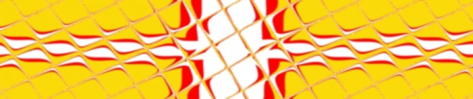
 Design D
Like Design A, this flag has no historical background, simply meant to represent the Dorset coast.
This design like the top design conveys a certain happy impression but one that is perhaps more suggestive of the Caribbean or South America than an ancient county of old England. Wavy lines are not uncommon in corporate logos or sporting motifs – in these contexts such designs are not out of place but one must wonder if it would be appropriate to represent an ancient English county with such a modern, trendy quasi-logo pattern? Irrespective of colours, the informed individual is likely to have certain expectations about what an English county flag should look like. A similar design in different colours was used thirty years ago as the corporate logo of a chain of food stores – is this really appropriate for the venerable county of Dorset?
