Heraldic arguments for the design
Why not green or blue?
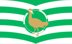
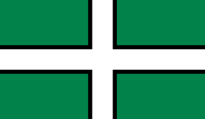
This is a very reasonable question. People have said, “I think Dorset, I think green.” This is true, but then don’t most counties in England claim that they think of their county as green? What about Scotland, Ireland, Wales or France, Germany, Austria? Isn’t all of Europe very green? It’s not a distinctive colour, it’s generic. Keep in mind that Devon, Wiltshire and Gloucestershire already use a significant amount of green in their respective flags – the design for Dorset should stay distinctive in mind of this or our flag would blend with those and not stand out like it should.
Blue, what does it mean? The sea? Again, see above.
Most of all though, we need a flag that is bold and will stand out. Using blues and greens will not do that. Green flags on a green setting? For that matter, blue and green flags on a green setting? Blue and green against the sky? Adding green to the existing design will hamper it’s impact and complicate a simple design.
Stephen Coombs, originator of the flag points out:
“I just needed a tincture that together with red and silver would provide a trio not found in any other well known flag. Any of the available heraldic colours, as distinct from the metal gold, would not have done the trick. Red, white and blue are the commonest flag colours, red white and black are Nazi colours, red white and green are those of Italy, Hungary and Bulgaria. I didn’t seriously consider purple because it’s rare in flags and heraldry (except in Spain and Portugal) and tends not to be much liked.”
See the bottom of this page for a comparison of local county flags – now you tell me, which stands out the most?
But clashing red and yellows/ That yellow is too bright or too dark?
Yes, but this is heraldry, not going out on a Saturday night! The Flag Institute details that a flag should be bold and striking in order to be seen in a crowd and memorable too. If we colour co-ordinate flags, they will not stand out, they must clash in order to stand out….think of the Union Flag; red, white and blue. Heraldic colours do not have specified shades either, leaving it largely to the depicter’s discretion – the gold in the Flag can be lightened or darkened.
See the ‘Rule of Tincture’ below.
What about shields, crests, arms etc?
Heraldically called Charges. From Flag Design, published by the Flag Institute: “The objects placed on a flag need to be simple, distinctive, meaningful, large and well-placed. Flags should not, if at all possible, be charged with words, letters, numbers, or mottos, nor with shields, or whole coats of arms.”
If we start placing complex shields or arms on flags, the cost of the flag to reproduce will skyrocket. This is not an armorial banner or standard – its principle aim is to be used by many people or in many places. It needs to be cheap to reproduce.
Ultimately, whilst up close, a complex arms or symbol may look great – from 100 metres away, it will be extremely difficult to make out the detail:
West Virginia, USA. What are we looking at?
Remember of course that the Dorset County Council Arms are a symbol of that organisation, not Dorset. They are for their use only and this is a legal reason. The arms are not in the public domain, even though we may pay for the council and vote them in.
Rule of Tincture:
Stephen Coombs, originator of the flag stated “This is technically superior to the Devon flag in heraldic terms, in that we have metal on colour (in the heraldic sense) on metal. The Devon flag with colour on colour (black on green) is a serious breach of heraldic etiquette.”
In heraldry, metal colours usually refer to yellow and white. All others are referred to as colours. The idea is not to place colour on colour, or metal on metal as the designs colours will merge and become indistinct from a distance. Dorset’s Flag places white(metal) on red(colour) on gold(metal). Thus all colours stay fresh and highly visible and above all it has impact.
Jason Saber, a member of the Flag Institute, made the following points regarding a good flag:
– Symbolism – it must obviously suggest the entity it represents (this doesn’t necessarily have to mean it’s representative to outsiders but as long as it’s meaningful or sensible to the people it’s representing);
– Distinctiveness – it should be different and stand out from amongst other flags – when one sees for example, all the flags of the West African states one can be hard to pressed to distinguish them;
– Simplicity – a flag should not be too complicated – too much detail destroys the impact of a flag , essentially a flag should be simple enough for a child to draw it;
– Impact – overall, taking all the above into consideration, the finished product should ideally be striking or eye-catching – bold and beautiful!
He agreed that Dorset’s Flag reached all the criteria.
The symbolism has been explained – the colours are of Dorset.
This flag is distinctive in colour – it is different to other county flags in the area.
The flag is simple – it’s easy to recreate.
Impact – arguably – the flag does stand out.
Compare the Dorset flag against other local flags:
Gloucestershire
Devon
Cornwall
Dorset


